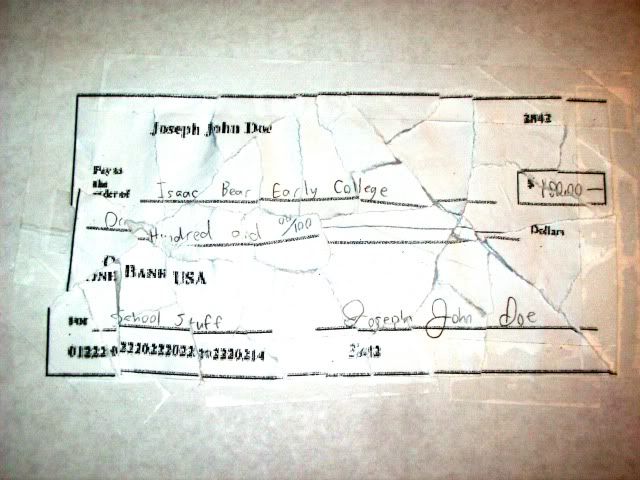
Twelve general questions are asked when comparing handwriting samples:
- Line quality: do the letters flow or are they written with very intent strokes?
- Spacing of words and letters: what is the average space between words and letters?
- Ration of height, width, and size of letters: are the letters consistent in height, width, and size?
- Connecting strokes: how are capital letter connected to lowercase letters?
- Strokes to begin and end: where do the letters begin and end on the page?
- Unusual letter formation: are any letters written with unusual slants or angles? Are some letters printed rather than written in cursive?
- Pen pressure: how much pressure is applied on upward and downward strokes?
- Slant: do letters slant to the left or right? If the slant is pronounced, a protractor may be used to determine the degree.
- Baseline habits: does the author write on the line or does the writing go above and/or below the line?
- Fancy writing habits: are there any unusual curves and loops or unique styles?
- Placement of diacritics: how does the author cross the t's and dot the i's?
- The pen pressure is higher towards the bottom of the letters.
- Most repeats of the same letter have a different appearance.
- Many letters are started at the bottom rather than the top.
- The sample shows a very quick, intent style rather than a flowing style.
Sadly, since handwriting can be varied by emotions, stress, or even writing implement, handwriting analysis is not a definitive science and is often inaccurate because of how easily handwriting style can be altered.

No comments:
Post a Comment